Business
Sep 11, 2025
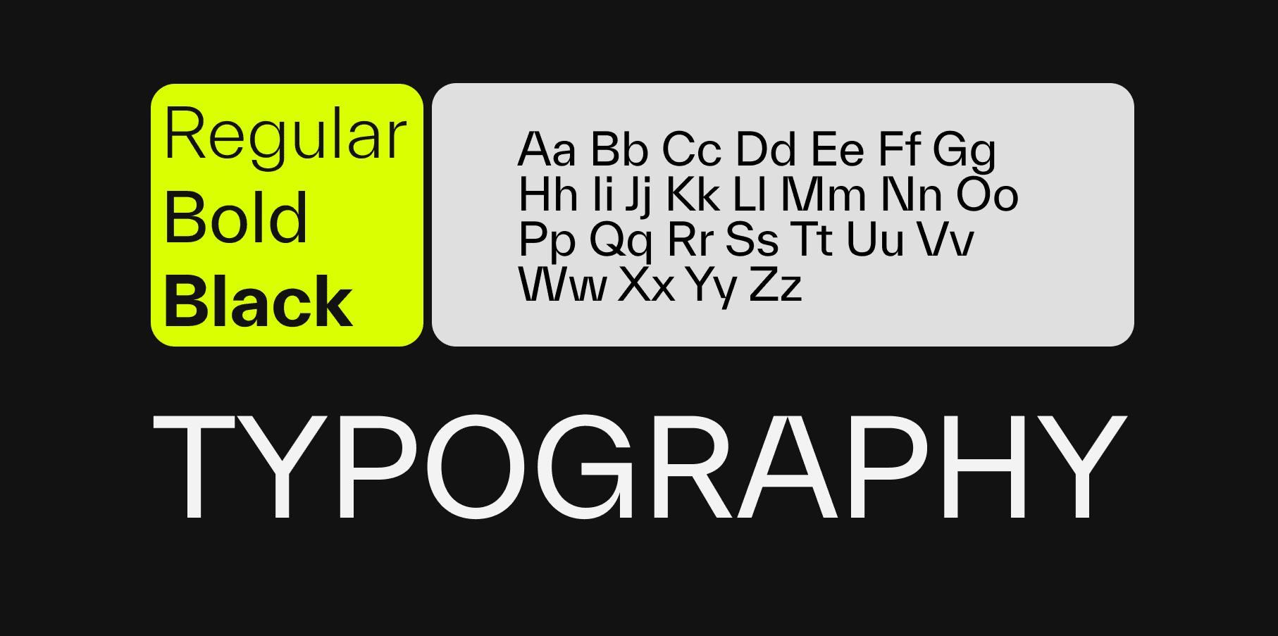
Typography is often discussed as a visual detail, but in digital products it behaves like infrastructure. It defines reading speed, trust, orientation, and decision quality long before users evaluate individual features. A product can be technically excellent and still feel unclear if its typography system is inconsistent.
In practice, typography shapes how users perceive competence. Dense copy, weak hierarchy, and inconsistent spacing increase cognitive load. Clear rhythm, predictable scale, and high contrast reduce effort and let users focus on tasks instead of deciphering the interface.
That is why font decisions should not be treated as a one-time branding choice. They are operational product decisions with measurable impact on comprehension, completion rates, and support effort.
Most teams still discuss fonts in terms of style categories such as modern, elegant, technical, or playful. That vocabulary helps with tone, but it is too limited for product work. Typography also controls hierarchy, error visibility, scan paths, and perceived reliability.
Users rarely read screens linearly. They scan first, decide where to invest attention, and only then start reading. A strong type system supports this behavior through clear heading levels, stable spacing logic, and consistent contrast. A weak system forces users to repeatedly re-interpret importance.
When hierarchy is unstable, everything starts to compete. Buttons become less legible, helper text gets ignored, and critical states are easy to miss. The consequence is not only aesthetic inconsistency but also slower task completion and higher interaction risk.
The biggest shift is from ad hoc styling to defined rules. Teams stop deciding type styles screen by screen and start managing typography as tokens, scales, and constraints. That transition reduces design drift and speeds up implementation because decisions are pre-aligned.
Operationally, this means a limited set of semantic text roles, for example display, heading, body, label, and caption, each with explicit behavior across breakpoints. It also means fixed rules for line length, spacing rhythm, and contrast thresholds in both default and edge states.
The result is better collaboration across design and engineering. Fewer discussions happen around personal preference, and more around outcome quality. Review cycles become faster because typography can be validated against shared criteria rather than subjective taste.
A scalable setup starts with intent, not with a font library. Define what users must do quickly on each key journey, then derive type requirements from that behavior. Data-heavy workflows need strong scan performance, while narrative pages require sustained reading comfort.
Next, define a compact scale that is expressive enough for hierarchy but small enough for consistency. Many mature teams use one primary body size, a small set of heading levels, and strict spacing increments. This creates predictable rhythm and lowers implementation variance.
Finally, validate in real conditions. Typography that looks balanced on large desktop screens may fail on smaller devices, low brightness, or rushed usage contexts. Test readability, hierarchy recognition, and error-state clarity under realistic constraints before rollout.
Typography work is not done at launch. Products evolve, content grows, and component libraries expand. Without governance, local exceptions accumulate and the system degrades. Sustainable quality requires routine audits, explicit ownership, and versioned updates to type tokens and usage rules.
Teams that treat typography as a long-term asset gain more than visual consistency. They reduce cognitive friction, improve conversion-critical clarity, and strengthen brand trust at scale. Typography is not a finishing layer. It is one of the core systems that decides whether product communication works under pressure.
![[object Object]](/_next/image?url=https%3A%2F%2Fcdn.sanity.io%2Fimages%2Fqnbxd1h1%2Fproduction%2F8727914f0f746a2c080b0900f9295d01e6fe1c89-930x1240.jpg&w=1920&q=75)
Dan Wojcik
Managing Director / UX
Convinced that we are the right ones for your project? Let's work together!
Contact us via email, and we will get back to you promptly.