Design systems that scale
A great design system turns your brand into tokens, robust components, and a lean build pipeline. We combine consulting, UX design, and software development to ship a system that works beautifully in Figma and performs in code—with governance, docs, and a smooth rollout.
- Lower cost: Higher reuse cuts design/dev effort and QA loops.
- Faster releases: Versioned components + CI/CD → shorter lead times, fewer blockers.
- Cleaner journeys: Consistent patterns across touchpoints reduce cognitive load and drop-offs.
- A11y by default: WCAG-compliant tokens and semantics prevent accessibility regressions.
- Scalability: Theming (brand/light/dark), i18n, and multi-product setups become manageable.
- Stronger collaboration: A shared language (tokens, props, guidelines) removes handoff friction.
Without a design system, the “cost of variety” climbs: tiny UI deviations create design and tech debt, slow down releases, and break journeys. A design system concentrates brand logic, interactions, and code into reusable blocks—reducing day-to-day complexity and making speed predictable.
Best timing
When you have 2+ product teams, multiple brands/markets, a high release cadence, or visible UI inconsistency—and whenever A11y requirements, rebrands, or tech migrations (e.g., a new frontend framework) are on the roadmap.
Measurable outcomes
Core KPIs: component reuse rate, time-to-ship, UI defect rate, A11y compliance, and onboarding time for new team members.
Our services
Our services
Discovery, Audit & Strategy
We assess current UI, components, accessibility, and code quality. Then we define a prioritised roadmap (Foundations → Core Components → Templates) with adoption and quality KPIs.
Design Tokens & Foundations
Color, type, spacing, radius, shadows, motion. Clear naming, theming-ready (light/dark/brand variants), aligned with your tech stack.
Core Component Library (UX + Code)
From buttons to tables: research-driven, accessible, responsive. In Figma with smart variants; in code as production-ready components (e.g., React + Tailwind/SCSS), documented in Storybook with props, states, and usage.
Accessibility & Quality
WCAG checks, semantic patterns, focus/contrast rules, interaction and motion guidelines. Automated tests (visual regression, a11y linting).
Documentation & Guidelines
A living handbook: usage, do’s/don’ts, content styles, error states, responsive rules, contribution flow.
Tooling & Pipeline
Token syncing (e.g., Figma Tokens/Style Dictionary), build setup, versioning, SemVer releases, CI/CD, package distribution, changelogs.
Rollout, Training & Governance
Pilot with 1–2 product teams, training for design/dev, maintenance plan, owners & contribution model, KPI tracking (adoption, reuse rate, UI defects).
Design Systems
Convinced that we are the right ones for your project? Let's work together!
Begin your inquiry now
Contact us via email, and we will get back to you promptly.
Type of request (optional)
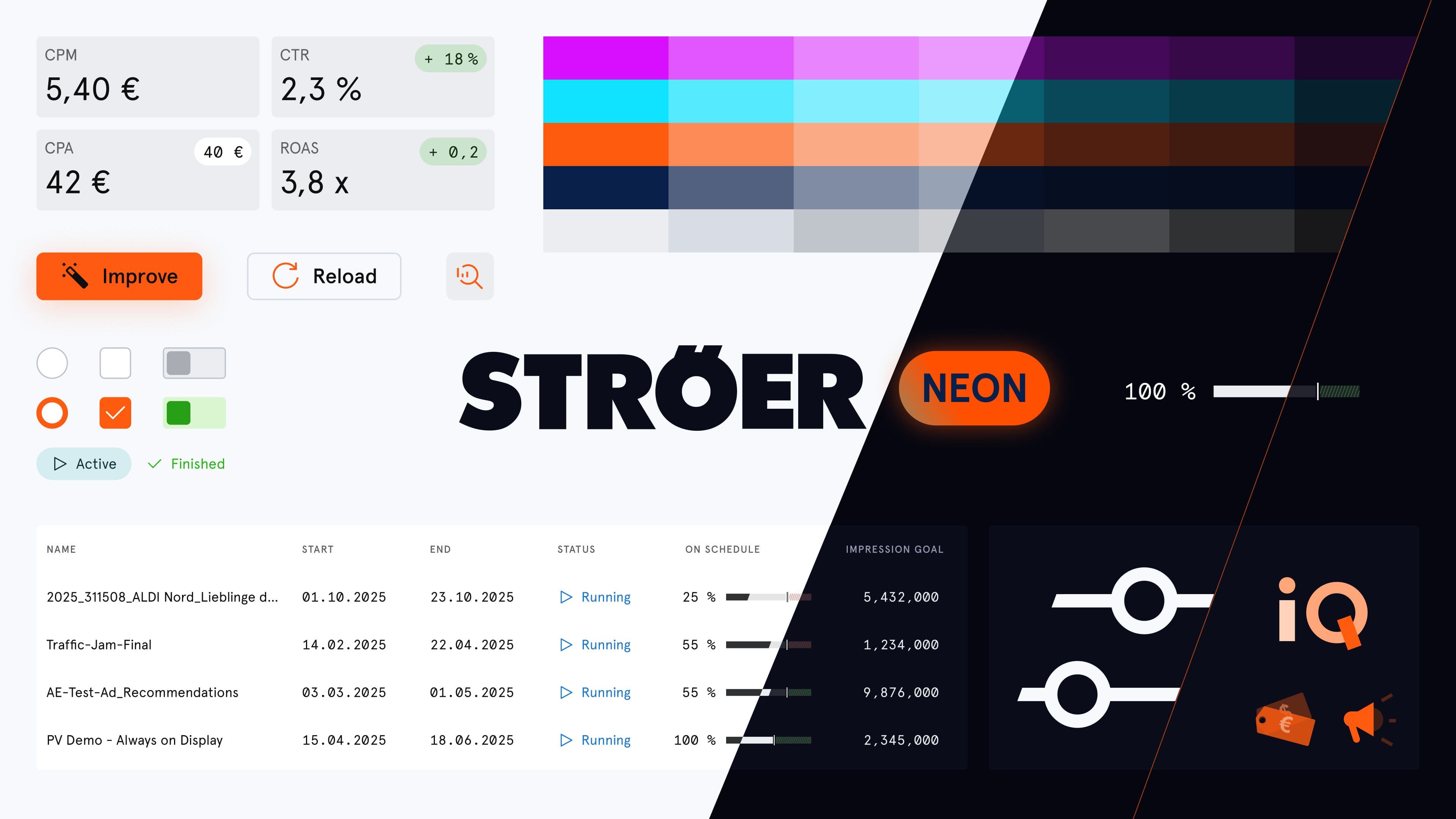
- fig 1.1
AI Strategy
With our expertise in artificial intelligence, we help companies optimize processes and gain a competitive edge. Our tailor-made AI solutions are customized for your industry, increasing efficiency in sectors such as healthcare, finance, and retail.
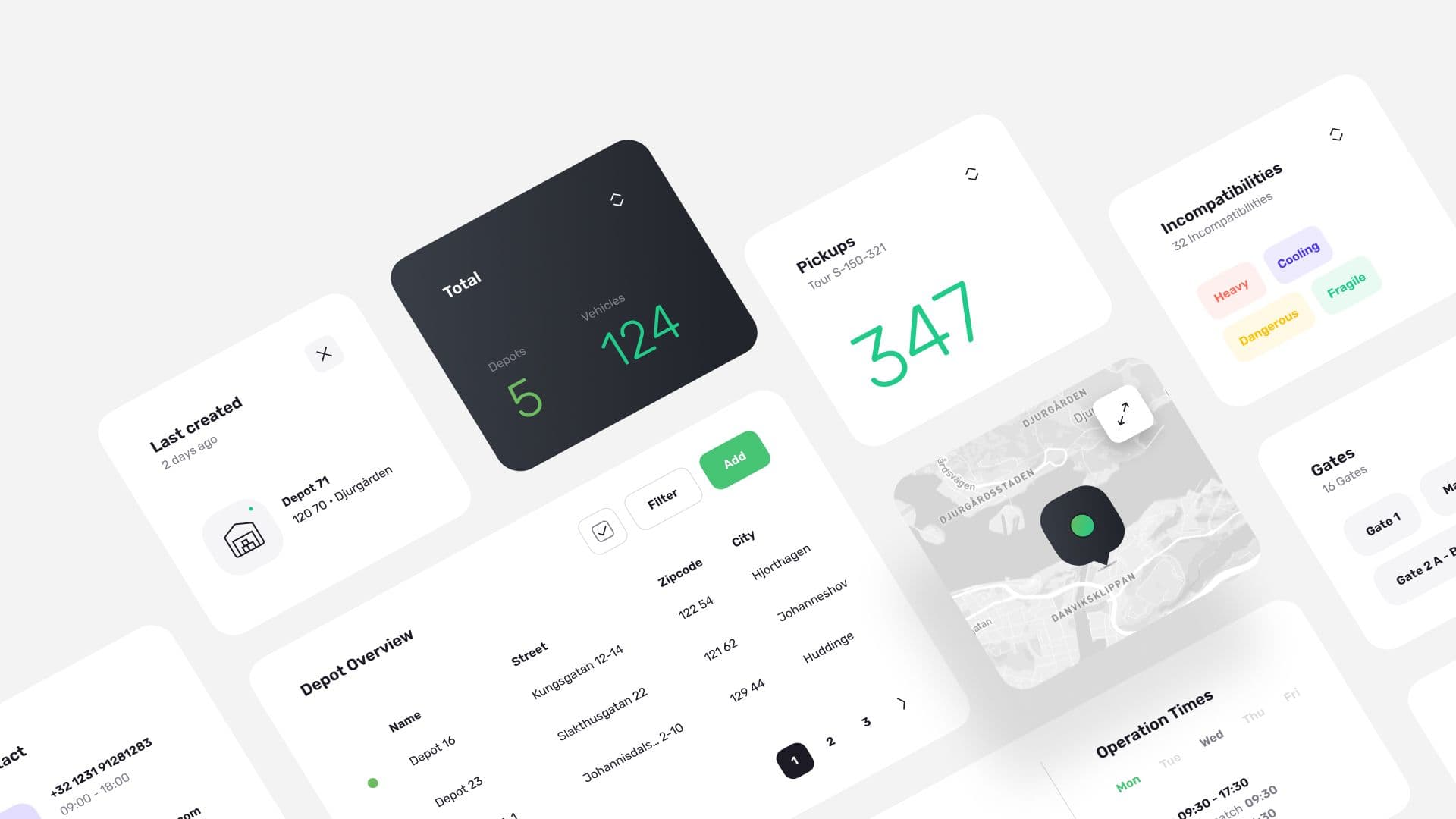
- fig 1.2
Web Solutions
Our mission is to create an intuitive and unique user experience. We specialize in concept design, UX design, and application development, always putting the user at the center. Through tailored solutions, we ensure efficiency and ease of use.